
Business Opportunity
After launching many successful products, our development team expressed the friction they encounter when developing a new product: reusability.
Our components in code were all over the place, different engineers worked on different components, and there was no centralized source of truth to understand what’s available. I was tasked to bring some order to the chaos.
⭐️ The Goal
Create a new accessible, customizable, ready-to-use design system and component library which we could use for all future products, and redesign old ones.
⏱️ Duration
September 2022 → April 2023 (7 months)
👯 Team
Lead Product Designer (Me)
Lead Development Manager / Product Owner
5 Developers
👩💻 Users
Our developers
All other products’ users
🧠 Challenges
No idea what future projects this design system may be used for.
Needed to ensure accessibility across all platforms and devices, and be entirely customizable for potential projects’ branding, likely white-labeled like past projects.
All features from past projects should be supported (if not enhanced) by the new design guidelines if we decide to back-sync.
🏆 Results
An organized and efficient design-to-developer shared language and hand-off for all future products.
Improved product velocity (what used to take months now only takes weeks!)
A unexpected opportunity to completely redesign an older product using this design system that ultimately enabled new use cases for our end-users, improving product satisfaction.
A 200% reduction in expensive hot fixes.
The Problems
After spending some time unpacking the situation further, these are the major issues that emerged.
🧑🏼⚕️ Users struggled with…
Clunky data-tables with limited functionality which inhibited their ability to effectively do their jobs. No tools for customizing these tables for individual preference. Information was not very readable and not very usable.
No ability to preview a file without downloading it. Their daily workflows require dealing with many sensitive files, so not only were the downloads clogging up their computers, it was also a massive security risk.
Inability to quickly scan for the specific things they needed on information-heavy screens.
A not-so-ideal color scheme after having to edit their brand colors to comply with the Web Content Accessibility Guidelines, WCAG 2.1. (Due to incorrect usage of color in the original product.)
Lack of clarity when certain icons or indicators were used to convey something without accompanying text.
👨🏽💼 Customer Service struggled with…
A constantly confused user base that needed to be guided through many steps of onboarding.
An influx of requests for product customizations which they were ill-equipped to accept or reject until speaking with development — a long unpleasant game of telephone.
Remaining fairly in-the-dark about product decision-making. The people tasked with working on the front-lines with our users were often the last to know about navigation changes and feature updates. This made their jobs substantially more difficult.
💁🏻♂️ Project Managers struggled with…
An enormous stack of tickets to create and manage. Every time a client needed a change, big or small, the task would be funneled through our pipeline and eventually land on me or a developer to solve.
Inability to fulfill customer requests due to development constraints and the backlash the followed.
👩🏽💻 Developers struggled with…
Scattered code and poor consistency. Every new product had its own component library which slightly differed from the Figma components I used in designs. The mess caused unnecessary friction and complexity for developers to work within.
Hundreds of tiny requests to change pieces of information or improve usability in specific areas without a plan for the bigger picture. This was frustrating and a time suck from more interesting work.
Manually tinkering with accessibility requirements for impending WCAG 2.1. audits.
🙋🏻♀️ The Designer (me) struggled with…
Design system work was simply never prioritized during business-as-usual. We were sitting on a mountain of tech debt and design debt that was difficult to pay down when customers were constantly knocking for help.
No single source of truth. This led developers to overlook many design details, and eventually bugs.
Kept getting lost in the trees & missing the forest. Putting out little usability fires didn’t get us any closer to a sustainable system-level solution for so many of the problems I knew our users were facing.
Opportunities & Success Criteria
I asked myself how might we introduce some system-level solutions which would reduce all of our stakeholders pain points?
❌
Scattered Code
✅
One Single, Discoverable, Plug-and-Play Source of Truth
❌
Limited Front-End Customization, Too Many Requests for Devs
✅
Powerful Tools for Users to Customize Their Own Workflows
❌
Design Inconsistencies, Internal & Client-Side Invisibility
✅
Clarity, Familiarity, Reusability
❌
Poor Accessibility, Poor Accessibility Development Process
✅
Efficient, Programmatically Ensured Accessibility
From here on, I made sure to operate in pursuit of these goals.
What I Did
1️⃣ Research & Inspiration
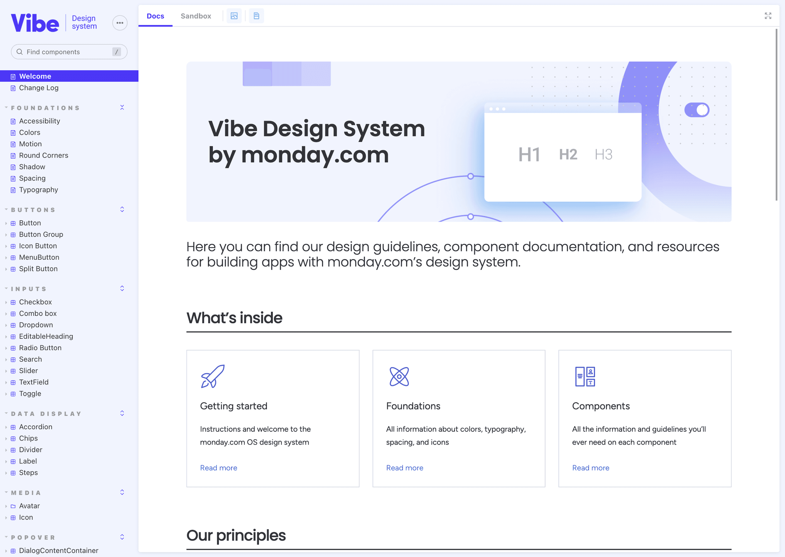
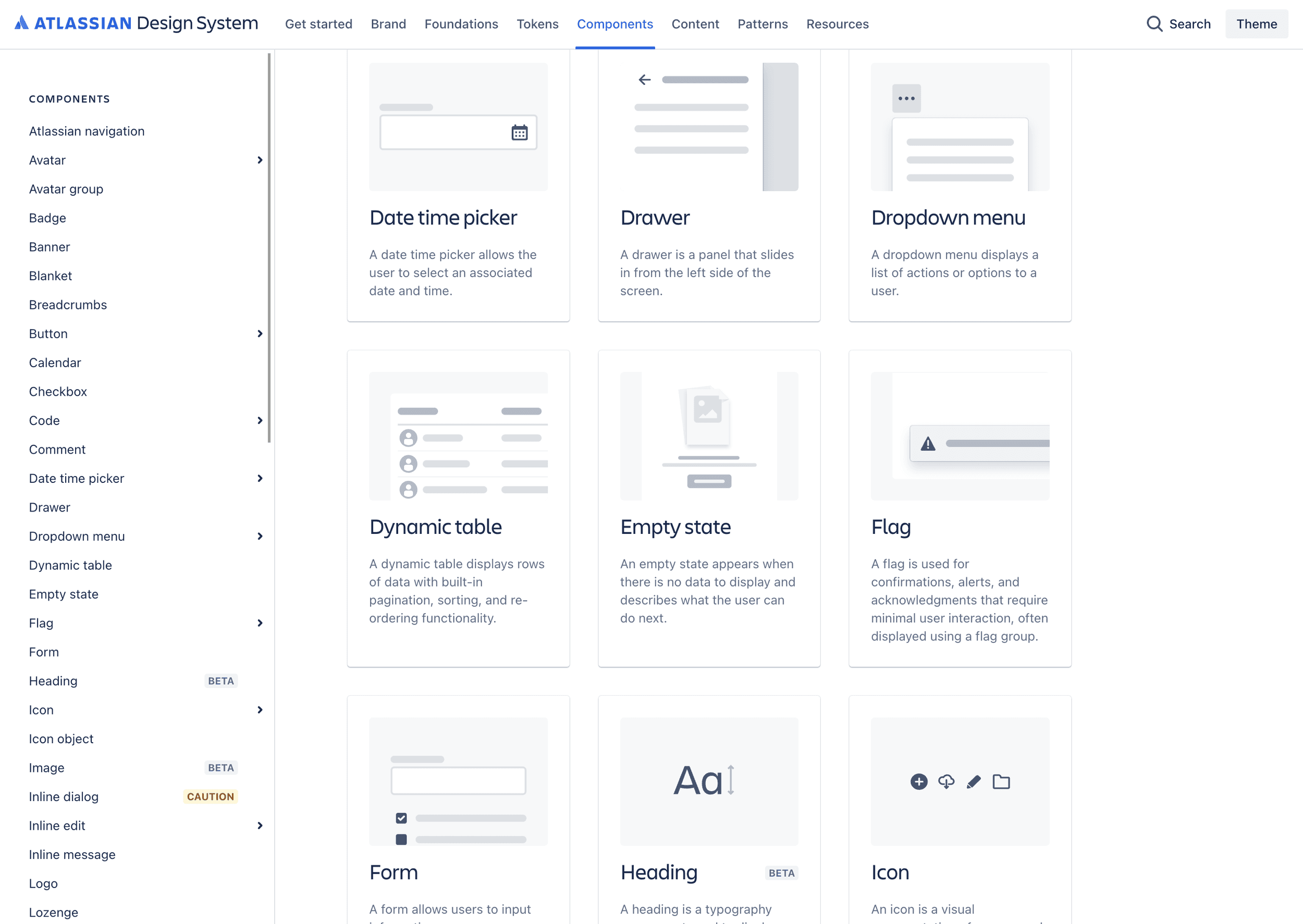
I gathered and closely examined industry leading design systems for enterprise products. Google’s Material UI, Vibe by Monday.com, and Atlassian were my biggest inspirations, namely for the way all three displayed and managed large complex data sets.
Seeing how complex problems were handled well in all these products helped me realize what our products often lacked and what we could easily improve with new components and design rules.

My whole team agreed that it would be safer to use an existing library to base ours off of.
I put together an argument for using Google’s Material UI, which would have been more ideal for me due to their robust existing features and design documentation, but I eventually lost the battle to Bootstrap which my team was already familiar with.
2️⃣ Evaluate & Reimagine
HOTB doesn’t conduct formal customer research or usability testing. We also have extremely limited access to our users since our primary point of contact the person purchasing the software for others to use.
The insight that we do have comes from the influx of feature requests and bugs that have crept all the way back to us if users do encounter serious problems.
Typically quick local changes are preferred by management. But I have observed how much development time it wastes to continue to take on more tech debt with poor decision-making. This design system project was our chance to undo some of that damage and prevent future problems before they started.
The goal was to redesign everything, both for happier end-users and happier HOTB developers. But some challenges were more complex than others. Such as…
🎨 Colors
The colors problem was an extremely difficult one to solve because:
Nearly all of our products would be white-labeled templates. No guarantee on the exact palette.
We wanted to empower clients to choose colors themselves so we wouldn’t have to keep changing them manually.
In government software, accessibility is a BIG deal. The white-labeling tools needed to ensure at least AA-rated contrast for ALL colors across ALL components. (According to WCAG 2.1, Success Criterion 1.4.3 Contrast)
Bootstrap’s new utility classes saved the day in many places. I demanded that color accessibility was programmatically ensured at the component level so we would never again be surprised by unreadable text.
This also required a change in mental design philosophy.
In prior products, we relied on colored text to display emotion or status. But when proper contrast wasn’t met, it forced us to update the whole color system, which didn’t look very nice.
In this model, I used color much more sparingly, reserved more for icons, buttons, and background, instead of the text itself. (As recommended by WCAG 2.1 Success Criterion 1.4.1 Use of Color.)


🗃️ Tables
Our products are very data-table-heavy, but our tables were not powerful enough to give our users all the functionality they need.
Stakeholders always wanted to cram as much information as possible into too little space. Plus, due to the nature of our white-labeled-template products, they all had their own ideas and what they wanted to see.
What our new data-tables needed was customization tools, configurable by the user themselves, so the development team would not longer be involved in making these highly personal display decisions.
This is the one area I insisted was particularly well executed by Google’s Material UI, so my team decided that we’d carefully study and rebuild all the best features ourselves.
We decided to add:
More effective hover and select states on rows.
Denser visual appearance to accommodate heavier data sets.
A system of “top controls” with a consistent order and appearance that would automatically exist for most tables.
Column resize, reorder, and hide/show.
Advanced filtering, and saved filter groups.
Reduced appearance of pagination controls to keep the eye on the more important stuff.
Inline editing capabilities. (Based on user’s permissions.)


Swarm UI Tables
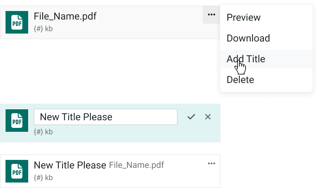
📑 Files
There was inconsistency around how uploading and downloading file attachments worked.
Also, there was no way to actually preview a file. Users were forced to download files in order to view them, which our team has heard countless times it was a pain point for them.
But importantly, this created serious security risks and device storage risks from having loads of sensitive work files stored on people’s personal computers.
We decided to add:
3 different sizes of file attachment displays with consistent embedded functionality — click to preview, context menu to download, rename, edit, delete, or anything else.
A universal, multi-file, drag-and-drop upload modal which would appear wherever file uploads were prompted.
A universal file preview modal which would open the same way every time everywhere.
These were particularly tricky to create due to how differently file types behave and what information the front-end has access to. I collaborated very closely with engineers to work through these problems and create a sufficient file preview experience.

✏️ Forms & Inputs
Giant pages of data inputs, especially in a read-only state, were especially difficult to quickly scan and interact with. Our users typically hop quickly between several very information-heavy screens and would get lost looking for the information they needed at a glance.
To solve this, we introduced:
Stacked and inline version of every input type.
Improved spacing to increase.
Read-only versions of every input type, with hover states to better indicate what labels go with what information.
Read-only hover state actions, like pin and copy, to make the information more immediately actionable.

📍 Among Other Things…
Foundations: Spacing Units, Shadows, Typography
Data Display: Tooltip, Badge (Label), Badge (Chip)
Feedback: Progress Bar, Alert Banner, Alert Box, Toast, Content Modal
Navigation: Links, Breadcrumbs, Tabs, Side-Nav Menu
Buttons: Buttons, Dropdown Buttons, Button Groups
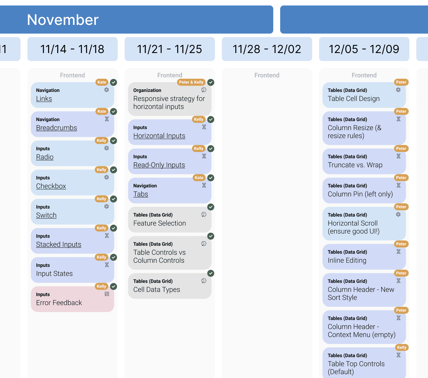
3️⃣ Plan the Development Timeline
I organized the proposed list of components into a logical Brad Frost-esque order for my development team to work on. Each component I’d slotted into the timeline was converted into one these tracker chips which showed:
Component name and category. (Navigation, input, table feature, etc.)
Discussion topic, atom, molecule, organism, template, page, or back-end items.
Assigned developer
Done / not done
In the many meetings that were held around this time, I asked my team of developers my team for feedback, advice, and estimates on difficulty and scope for the most ambitious ideas.
4️⃣ Supervise & Iterate
I set up weekly meetings to meet with each developer on their progress. We reviewed each component’s accessibility, adaptability, scalability, and visual details.
We set up a demo environment where each component was used a variety of scenarios so I could clearly see how it would show up in our applications. This allowed us to make necessary changes to them as we learned more information about implementation.
Results
🏆 A Beautiful & Organized Figma File
Each component was created with variants and props that matched how they would be built in React so design and development would have a shared language.
In addition to the components themselves, I created a separate page that showed off the components’ variety and explained all the different use cases and design guidelines developers would use when implementing. (Shown below.)


🏆 A Code-Based Source of Truth for Developers
🏆 A Complete Swarm-Refactor of an Older Product = Happy President & Happy Users
A surprise opportunity to test our work!
Every screen was rebuilt using the new design system — a process that only took about two weeks!
Because each component was bullet-proofed beforehand, the existing users experienced all the same features with additional functionality at no additional cost.
Many ancient feature request tickets from the President of the product could be closed because the Swarm-Refactor simply solved them out of the gate. We expect to get fewer future requests for this same reason, saving us precious developer time.
Since it’s been released, the wave of complaints many stakeholders anticipated did not come. Overall, according to our customer service team, the redesign has been well received.
One successful Swarm-UI release means we’ll likely be trusted to overhaul other products which would enhance the experience for those hundreds of users as well.
Connect with me on LinkedIn :)
Or email me at snvivonia@gmail.com